

Joyce Chen ’23

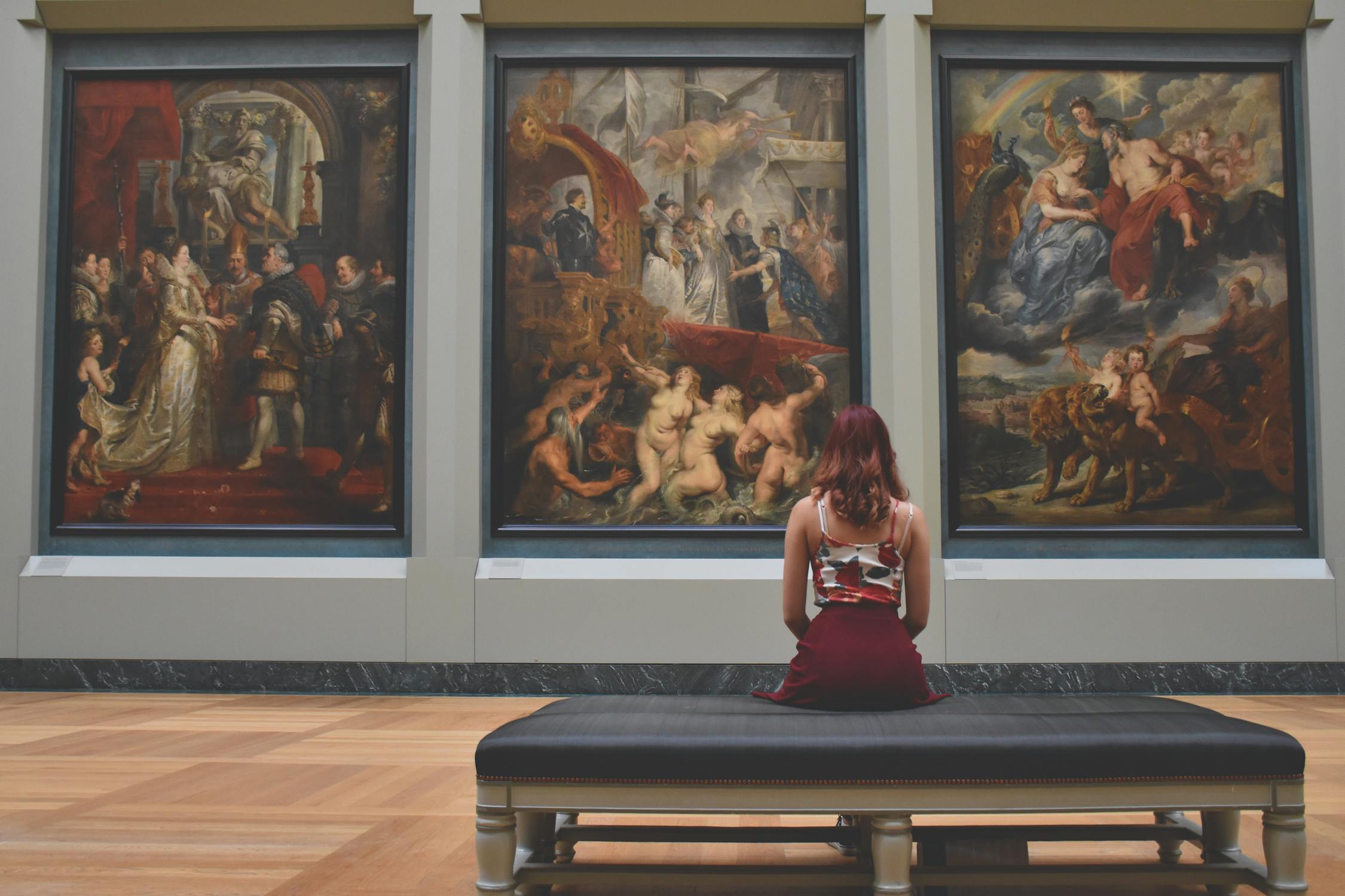
While one’s artistic tastes are subjective, there is a universal preference for certain colors in artwork. This was observed in recent studies that assessed participants’ color preferences by changing the color spectrum of several unfamiliar paintings. Overall, the participants preferred the color compositions most similar to the original paintings, though the reasons for these preferences remain unknown. Dr. Shigeki Nakauchi of the Toyohashi University of Technology and his research team further investigated the preference for original paintings over hue-rotated paintings in their study.
The team altered the color composition of ten Japanese and ten Occidental paintings for the C0 condition (original and hue-rotated). For the C1 condition (scrambled), they divided the original paintings into small squares and scrambled their positions to see if spatial elements influenced preferences. Then, they created patchwork images by scrambling similarly-colored squares from different paintings together for the C2 condition (patchwork). Lastly, they randomized all of the original and altered paintings for the C3 condition (randomized). A total of 90 Japanese and Portuguese participants selected paintings based on their preferences. For the C0, C1, and C2 conditions, selection rates for original paintings were higher than those for the altered images, proving that color composition is a factor in aesthetic choice. Specifically, the selection rates for C0 and C2 were much higher because they had similar color distributions. No preferences were demonstrated among paintings in the C3 condition; selection rates for original paintings were much lower than that in the C0, C1, and C2 conditions. Because color composition is the main factor that determines preference, the color-altered preferences had similar trends to the original and two types of scrambled paintings. Additionally, the participants’ cultural backgrounds influenced their preferences for Correlated Color Temperature (CCT), a system that measures yellowness and blueness from emitted light. The Japanese participants preferred a higher CCT, or a bluer light source than the Portuguese participants. However, the researchers did not find a link between cultural differences and color preference, as there was no trend among the average selection rates.
Dr. Nakauchi and his team’s experiment brought them closer to understanding the underlying neural mechanisms for specific color preferences. Further studies are needed to investigate the extent to which color composition affects the observer’s preference as well as the potential influence of cultural differences. This progress will aid in improved marketing and advertising strategies by utilizing color to attract customers.
Works Cited:
[1] S. Nakauchi, et al., Universality and superiority in preference for chromatic composition of art paintings. Sci Rep 12, 4294 (2022). doi: 10.1038/s41598-022-08365-z
[2] Image retrieved from: https://images.pexels.com/photos/20967/pexels-photo.jpg?auto=compress&cs=tinysrgb&dpr=2&h=750&w=1260
